Monday 30 November 2009

Rapture Billboards


Rapture Advertising


This would be a billboard poster maybe? :)

Saturday 28 November 2009

Rapture optical

Very poor attempt to make a short animation for TV channel.

Final Guidelines – Maybe...?


Final Business Cards


Hey so i decided to go with the logos below thanks for the comments :) I like them alot now i feel quite confident about using them.

Friday 27 November 2009

Rapture Final Final Logos!


Final logo set just gonna work a little on the top one i dont think it fits in with the rest of them :D

Rapture Guidelines


These are my trial set of guidelines for rapture print tomorrow and see whats wrong with them :)

Tuesday 24 November 2009

Business Cards – Rapture


The 4 business cards :)

Monday 23 November 2009

Letterheads Rapture


There are 4 Rapture buildings in the world NY, Sydney, London and Tokyo so i made 4 letterheads with a different colour of logo for each, don't know what i think of the idea yet just trying it out let me know what u think :)

Final Logo?


I'm thinking about this for the final logo for Rapture TV channel for the ISTD brief.

The colours represent the colours in the natural phenomenon Aurora borealis so i wanted to make a very bright logo that looked like different colours of light, which is also why there is 4 different logos i was thinking of not choosing a definite colour but the colour could change everytime you see the logo.

Let me know what u think ? :)

Friday 20 November 2009

Rapture Variations


I feel spoiled for choice im not sure what set i prefer i'm also not sure if i want to use all the colours help ! :(

Thursday 19 November 2009

Rapture - (channel x)


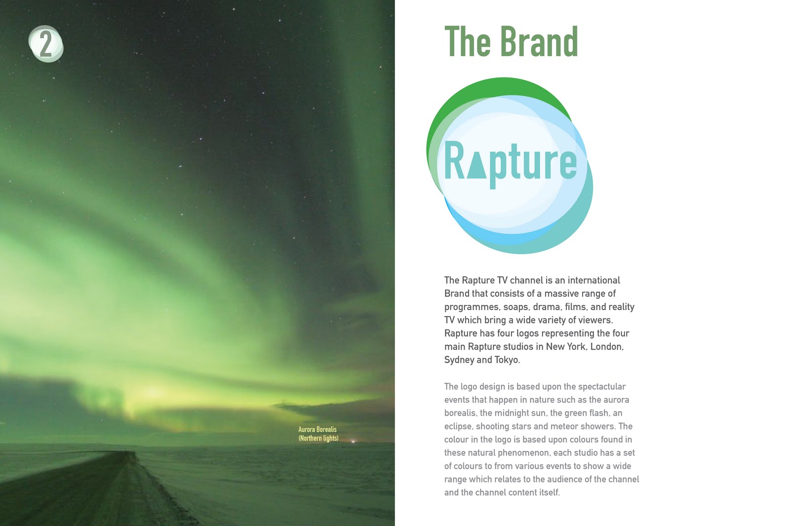
Some logo ideas for the TV channel ISTD brief let me know what u think.

The concept behind the logo is natural phenomena so ive got the colours from the aurora borealis and i was thinking i would use 3 different logos that would appear in between the shows on tv so one time u see it, it would be green then next time it might be blue then it might be red.

I tried using wavy lines above rapture and making rapture the same colour as the lines to represent an aurora but i think it looked a bit too feminine so i thought the circle and bold condensed type look more manly-ish, but not too much that it will put off women.